
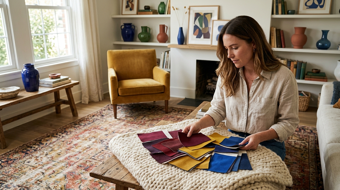
Adding color to a room without committing to a permanent paint job is one of the most effective ways to refresh a space. According to recent interior design trends, renters and homeowners alike are prioritizing temporary decor solutions to maintain flexibility in their living environments. This approach allows for rapid aesthetic shifts without the mess or cost of traditional renovation. However, achieving a cohesive look requires more than just buying bright items. It demands a strategic understanding of texture, scale, and color theory. Many people struggle to make temporary decor look intentional rather than chaotic. This guide outlines the critical errors to avoid and the proven methods to implement color successfully.
Understanding Temporary Color Strategies
Before diving into specific errors, it is essential to define the core concept of non-paint color application. Temporary color application is the strategic use of movable decor items to introduce hue, saturation, and value into a space without altering the permanent architectural surfaces. This method relies heavily on textiles, accessories, and functional decor to create visual interest. The goal is to create a layered look that feels curated rather than accidental. Success depends on selecting items that complement the existing neutral base of the room. It also requires a clear plan for how colors will interact with one another. By focusing on these foundational principles, you can avoid the most common pitfalls that lead to a disjointed aesthetic.
Mistake 1: Ignoring Texture and Material
One of the most frequent errors is focusing solely on color while ignoring texture. When you remove the permanence of paint, the tactile quality of your decor becomes the primary driver of depth. A room filled with flat, matte surfaces in similar colors can look dull and lifeless. Conversely, mixing textures like velvet, wood, metal, and glass adds richness even when the color palette is restrained. For example, a bright red pillow looks significantly more luxurious when paired with a natural wood side table and a metallic lamp. This combination creates a dynamic interplay of light and shadow. Without this textural variety, the color can appear flat and cheap.
To avoid this mistake, always evaluate the material composition of your decor items. Look for pieces that offer contrast in finish. If you are adding a bold blue throw, pair it with a woven jute rug or a smooth ceramic vase. This approach ensures that the color pops against a varied background. It also prevents the space from feeling overwhelming. The key is to balance soft textiles with hard, reflective surfaces. This balance creates a sophisticated and inviting atmosphere. You can explore curated collections that emphasize these textural contrasts to elevate your home decor. Visit our Home Decor section for items designed to add depth and dimension.
Mistake 2: Clashing Color Temperatures
Color temperature refers to the warmth or coolness of a hue. A common mistake is mixing warm and cool tones without a deliberate strategy. Warm colors include reds, oranges, and yellows, while cool colors encompass blues, greens, and purples. When these temperatures clash randomly, the result is often visual tension and discomfort. For instance, pairing a bright orange accent with a stark blue rug can create a jarring effect if not balanced by a neutral intermediary. This clash disrupts the flow of the eye and makes the space feel unstable.
To prevent this, choose a dominant color temperature for your room. If your base is neutral, you can introduce a secondary temperature through your decor. Stick to one temperature family for your primary accents to maintain harmony. If you want to introduce a contrasting temperature, do so in small, controlled doses. Use a color wheel to identify analogous colors that naturally work together. This method ensures a cohesive look that feels intentional. You can also use our Seasonal Collections to find decor that aligns with specific color palettes for the current time of year.
Mistake 3: Neglecting Scale and Proportion
Scale is critical in interior design, especially when using temporary decor. A common error is placing small, colorful items in a large, open space. These items get lost visually and fail to make an impact. Conversely, placing a massive, bright statement piece in a small nook can overwhelm the area and make it feel cramped. Proportion dictates that the size of your decor should relate to the size of the room and the furniture within it. Ignoring this principle leads to a disjointed and unbalanced aesthetic.
To avoid this, start with large-scale items like area rugs or statement pillows to anchor your color scheme. These pieces set the tone for the rest of the decor. Then, layer in smaller accents like candles, books, or small vases. This layering technique creates depth and visual interest. Always measure your space before purchasing decor. Ensure that your colorful items have enough room to breathe. You can find perfectly scaled decor in our For The Gal collection, which features items designed to add personality without overwhelming your space.
Mistake 4: Overcrowding the Visual Field
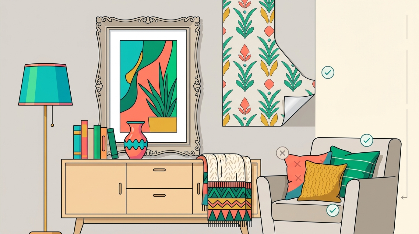
Enthusiasm often leads to overcrowding. When adding color, it is easy to want to use every bright item you own. This results in a cluttered and chaotic environment. Overcrowding dilutes the impact of each individual piece. Instead of highlighting specific colors, the eye is forced to scan rapidly across the room, missing the details. This lack of focus makes the space feel stressful and unorganized. A well-designed room needs negative space to allow the eye to rest.
To avoid overcrowding, practice the art of editing. Choose a limited palette of two or three main colors. Use these colors consistently across different items to create unity. Leave empty space on shelves and walls to let the decor breathe. This approach creates a sense of calm and sophistication. It also makes the colorful items stand out more effectively. You can find inspiration for balanced styling in our For The Bar collection, which demonstrates how to curate a focused and stylish display.
Mistake 5: Disregarding Lighting Conditions
Lighting dramatically affects how color is perceived. A common mistake is selecting decor based on how it looks in a store under bright, neutral lighting. In your home, the color may look completely different under warm incandescent bulbs or cool daylight. This discrepancy can lead to disappointment and a mismatched aesthetic. For example, a yellow decor item might look vibrant in the store but appear muddy in a room with dim, warm lighting.
To avoid this, view your decor items in the actual lighting conditions of your room. Use natural light whenever possible to assess true color. Consider the direction of your windows and the time of day when choosing your palette. North-facing rooms benefit from warm, bright colors to add energy. South-facing rooms can handle cooler tones to balance the abundant sunlight. You can also enhance your decor with our Home Fragrance and lighting accessories to create the perfect ambiance for your chosen colors.
Key Takeaways
- Texture is Key: Always mix materials like velvet, wood, and metal to add depth to your color scheme.
- Temperature Harmony: Stick to a dominant color temperature to avoid visual tension and maintain cohesion.
- Scale Matters: Use large-scale items to anchor your color and layer in smaller accents for detail.
- Edit Ruthlessly: Avoid overcrowding by limiting your palette and leaving negative space for the eye to rest.
- Lighting Check: Always view decor in your home's specific lighting conditions before purchasing.
- Strategic Placement: Use movable decor to create flexible and temporary color transformations.
- Curated Collections: Leverage themed collections to ensure your items work together harmoniously.
Frequently Asked Questions
How do I choose the right color palette for a neutral room?
Start by identifying a dominant color temperature that matches the mood you want to create. Then, select two or three complementary hues to use as accents. Use a color wheel to find analogous colors that naturally work together. This approach ensures a cohesive and intentional look.
Can I mix warm and cool colors without it looking chaotic?
Yes, but you must use a neutral intermediary to bridge the gap. White, beige, or gray can help separate warm and cool tones effectively. Limit the use of contrasting temperatures to small, deliberate accents to maintain balance.
What is the best way to add color to a rental apartment?
Focus on movable decor items like rugs, pillows, curtains, and wall art. These items allow you to introduce color without damaging walls or making permanent changes. You can also use removable wallpaper or decals for a temporary pop of pattern.
How does lighting affect the perception of color in decor?
Lighting changes the hue, saturation, and brightness of colors. Warm lighting enhances reds and yellows, while cool lighting emphasizes blues and greens. Always test your decor in the actual lighting of your space to ensure the colors appear as intended.
What are some easy ways to update my home decor for the season?
Swap out throw pillows, blankets, and table linens to reflect seasonal colors. Add seasonal flowers or greenery to your arrangements. You can also change your candle scents and colors to match the current time of year. These small changes can significantly refresh your space.
How do I prevent my colorful decor from looking cheap?
Focus on quality materials and textures. Avoid overly shiny or plastic-looking items. Mix high-end pieces with more affordable accents to create a layered and sophisticated look. Ensure that your color choices are harmonious and well-balanced.
Where can I find curated decor collections for specific styles?
You can explore our For The Gal and For The Game collections for curated items that blend style and function. These collections are designed to help you create a cohesive and personalized aesthetic.
Start Your Color Transformation
Adding color without painting is a powerful way to refresh your home. By avoiding these common mistakes, you can create a space that is vibrant, cohesive, and inviting. Start by evaluating your current decor and identifying areas for improvement. Then, select items that align with your color strategy and lighting conditions. Visit Scarlet Tassel to explore our extensive collection of home decor and accessories. Our team is ready to help you create a beautiful living environment that reflects your personal style. Book a consultation or browse our latest arrivals to begin your transformation today.